Will Work for Food
Howdy, cowboys and cowgirls!
Occasionally, a small business owner will approach me and ask me for a logo or help with their website, and I am more than happy to do that. However, what usually happens is that the “real problem” begins to reveal itself in the following discussions.
After a brief meeting with The 75 Oaks Neighborhood Farm, the “real problem” quickly revealed itself. A friend I had done some work for recently introduced me to Leeza, the owner of The 75 Oaks, who was looking for some “graphics help.” Always looking to “be of service,” I immediately rolled up my sleeves, and the next thing I knew, we were talking about labels for spices, logos, fonts, colors, and the struggles of a neighborhood farm owner trying to learn Canva. Leeza knows a lot about kernels, but not much about kerning, and she clearly needed a little help navigating the intricacies of file formats and best practices of graphic design. So, after a meeting to discuss her farm and its background and origins, it was clear that she had a vision, but it wasn’t being expressed visually.
This is the “real problem” with most business owners. They feel they must “do it all,” and nobody can see what they see or share their vision for their product or service. They are so used to doing EVERYTHING that they are more than willing to try. Even if the business owner is capable of doing the additional work, it really takes them away from what they are good at—and they’re usually good at running their business.
Time to stop horsing around
So, after our initial meeting, The 75 Oaks communicated their needs and vision for her farm well. It then became my responsibility to fix her logo and call it a day! Ha! Just kidding! What was clear after our meeting was that she needed a concept along with a brand guide to help her communicate with her customers on a personal level and maintain consistency. She needed something capable of conveying a personal message across multiple areas of her farm and, at the same time, being inviting enough to pique interest. The goals she has established for her farm are far-reaching and go beyond simple product promotions. What was needed was a concept to build upon with a brand guide that helped convey the entirety of the brand.
The brand guide is, as it describes, “A Visual Brand Identity for the Rest of Us,” and it helps anyone working on The 75 Oaks brand get a good idea of how to adapt the brand’s visual style to projects performed for The 75 Oaks.
The brand guide is designed to help effectively communicate the 75 Oaks brand message through design. It outlines the brand’s visual identity, including the color palette, typography, logo usage, and other key design elements. It also provides content and guidelines on how to use elements to create consistent and cohesive designs that accurately represent the brand—you know, design stuff!
See the PDF: The 75 Oaks Brand Guide
Old MacDonald Had a Logo
The client provided the logo, which features an oak tree. The tree in the logo represents the 75 oak trees on The75 Oaks farm, which holds great significance for the owners. The oak tree symbolizes strength, longevity, and resilience, which aligns with the farm’s values. I made a few modifications to the original logo provided to me, but I didn’t want to move too far away from where they were graphically. Providing additional file formats and color options for specific usage was all that was needed. I also maintained some of the original font choices for the same reasons.
The cow says “moo”
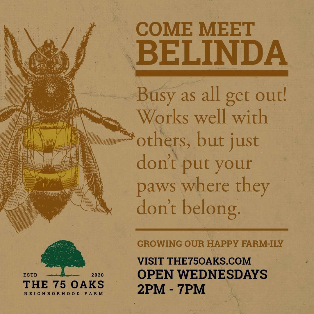
Now for the fun stuff! I couldn’t wait to approach the brand ads and express the ideas that were racing in my head. From the minute we started talking about the farm’s approach, its values, and how they would like to present themselves moving forward, I was like a kid in a candy store and couldn’t wait to begin ideation. As artificial intelligence encroaches on all of our creative positions, the one thing it can’t easily replicate is the human funny bone or the ability of the human brain to make connections that simply are not there. Humans are imaginative creatures that love to anthropomorphize (attribute human characteristics or behavior to a god, animal, or object), and that is precisely what I felt was needed here. To connect on a human level to the food The 75 Oaks produces, the products, and the farm itself. The concept was created around the idea of connection and can be applied in various mediums, whether it is t-shirts, social posts, or the occasional ad. The idea strives to connect nature, the farm, and, most importantly, the customers (the human). All these “connections” are a part of the “Farm-ily” and aim to convey this through the brand’s concept.
Don’t color all your eggs in one basket
One of my favorite things to do when creating a brand or style guide is to name the colors and describe why each was chosen. One of the things that goes largely unspoken by most graphic work performed is the color story and selection process. Taking the time to convey this information gives insight into the overall story and makes creating additional materials memorable.
The 75 Oaks Color Palette
Time to hit the hay
I had a lot of fun doing this one, and it shows. The goal is to construct a visual language that anyone can use to create their own materials, and this piece accomplished that goal. While it is not a definitive guide, it certainly assists in developing and decision-making for any marketing pieces created for The 75 Oaks Neighborhood Farm.
Do you need to create your own brand guide? Maybe you just need some “logo tweaks” or “help with your website.” :) Use the form here to contact me!
Want to know more about The 75 Oaks? Visit their site here!


